Informing the e-commerce design experience
with multi-method behavioral user research
overview
Blissful Nights had high Amazon ratings and consistent sales, but users weren’t converting on their retail website. The goal was to understand why and inform the new website redesign within a 4-week timeline.
As the first ever UX Lead at SBI, I was responsible for defining the research strategy and executing a multi-method study. I owned the research & design process and translated findings to design decisions.
The redesign resulted in an improved and efficient experience for users, allowing them to navigate the website more easily and with increased accuracy. This directly lifted cart conversion rates by 37%, contributing to user engagement and overall sales performance.
Blissful Nights | Retail Website Redesign
Role
UX Researcher
Methods
Usability Study
Heat-mapping
Tools
Crazy Egg (Heat-maps)
Affinity Diagram
Marketing Analytics
Duration
4 weeks
the problem
What I knew: According to Amazon customers, product quality was high. Sales were performing well. But the retail site brought in traffic that wasn’t converting. Most importantly, there wasn’t any user research feeding any of the current design decisions.
What I didn’t know: What specifically was driving cart abandonment on the retail site? How might we uncover exactly where and why customers lose confidence between landing on the homepage and completing checkout?
the research process
+understanding our users
in real time
+Shopify Analytics identified which pages had the biggest drop-off and the heaviest traffic.
For example, I was able to uncover that 43.38% of users landing on the Homepage immediately exited the website.
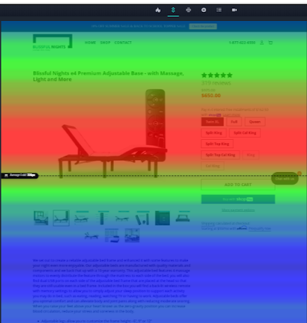
Using these insights, I could focus heat mapping where it mattered most rather than the entire site.
+Heat-mapping (2-week sprint across desktop and mobile) showed where users were and weren't engaging on select pages currently and which product features needed to be prioritized. I also used this tool to generate insights from actual users in real time.
+Customer service interviews & affinity diagrams
filled in the why. I spoke with the CS team to pull recurring all confusion areas and then categorized them into themes.
+Supplemental Usability Testing validated those pain points and surfaced new ones, (text fatigue, navigational friction, technical confusion), shaping the information architecture.
heat-map
+key insights
3. Misleading visuals and Missed opportunities.
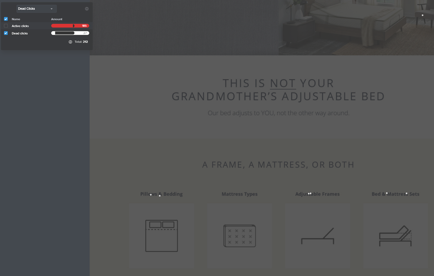
The white dots in the second image are “dead clicks” that users clicked on thinking they were buttons. There were 27 dead clicks on the homepage alone within the first 283 visits.
These pictures and labels were misleading, as well as a missed opportunity for CTA (call-to-action) buttons.
1. Users were not engaging with copy.
Product descriptions were long and technical, and heat maps showed users skipping them entirely. Instead, they were clicking on images and product features, many of which were dead ends or inconveniently placed under the fold.
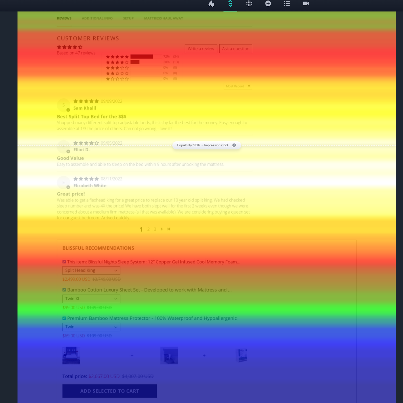
2. Users were engaging with reviews, but they were buried. Users were most engaged in the review section which was placed at the very bottom of product pages. The most persuasive content on the site was the last thing users reached, if they even reached it at all.
voice of the users
+key insights

moderated usability testing
+key insights

users / participants
6 people within target demographic
(adults, home-owners, comfort-focused seniors)
“Wait, how does it fit within bed frames?”
“What’s the difference between a King and a Split King?…I don’t get it.”
“Oh yeah, I like the ‘easy assembly. Didn’t know that.’”
“What's your return policy/warranty?”
I sat down with Customer Service who were apparently fielding 120–161 calls per week (on average), with the most common questions being what was included in the box, what "Split King" meant, and sometimes even what the product was. The website clearly had a communication failure. It was difficult for users to engage with copy because it was unclear and indigestible to them.
Using Google meets, I ran participants through test scenarios and website walkthroughs to confirm these pain points. Only 2/6 of the users were able to complete the tasks through the checkout process with an overall user satisfaction score of 16.7%.
The usability study not only validated the previously mentioned usability issues but also surfaced new ones and helped to improve the information architecture of the entire website.
When users were showing difficulty navigating the website, these pain points were the most notorious conversion blockers:
text fatigue: “product descriptions are convoluted and cluttered”
navigational friction: “categories are hard to find”
technical confusion: dead clicks, broken links, inconsistent pictures
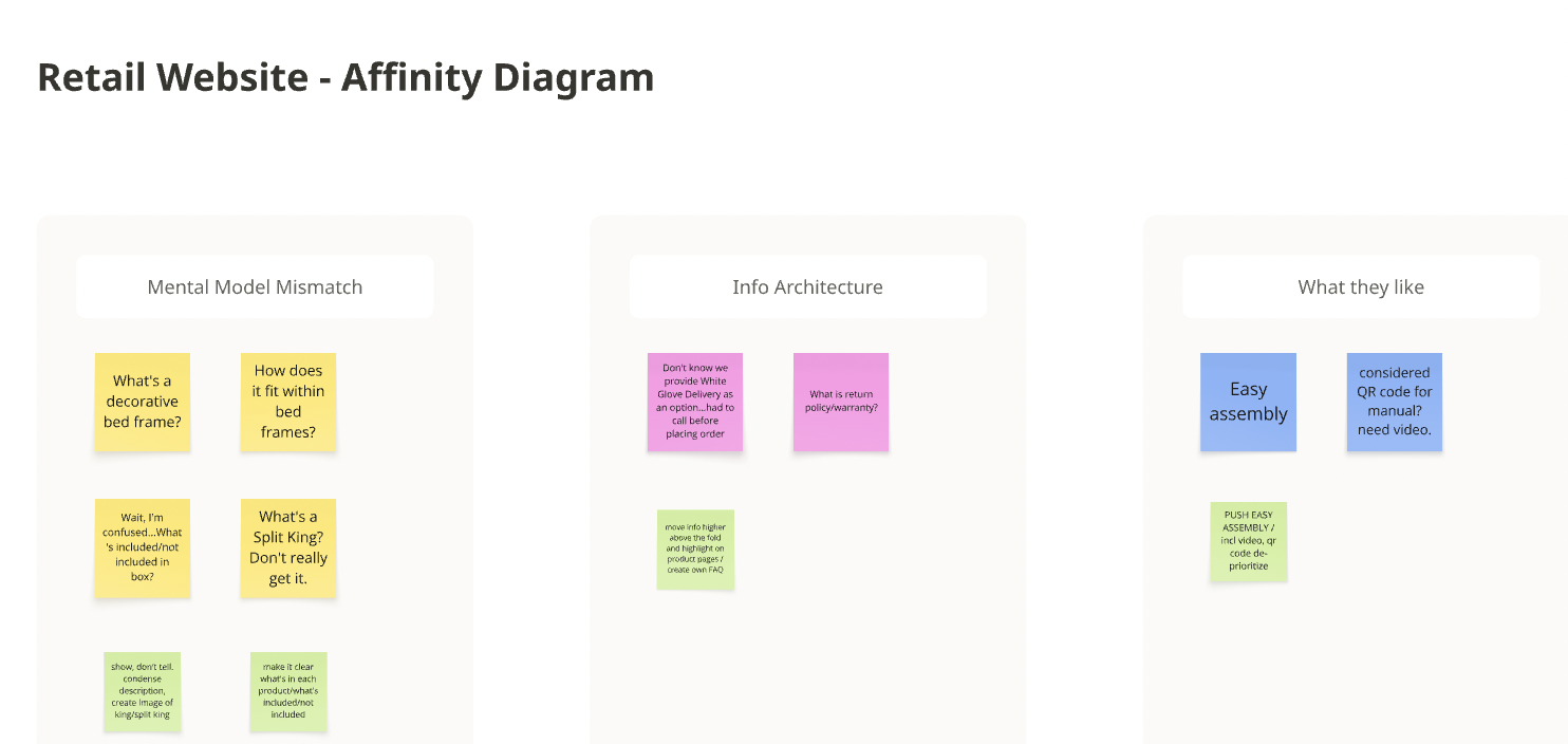
With these findings, I created an affinity diagram clearly labeling and categorizing the level of priority for each customer service complaint and usability testing insights. Based on the data, I was able to group complaints into themes of mental model mismatches or info architecture issues. This helped with directing my next steps in fixing the navigational or usability issues within the user journey.
design decisions
With a clearer vision of how the website needed to look and operate, I decided to completely overhaul the website and apply these structural changes. Here are a few:
I created a visualizer to show the clear difference between a King and Split King.
Reviews moved up on product pages closer to the decision point.
Product descriptions were rewritten to be scannable with size comparison visuals added for our Split King to end confusion. Although this was a tradeoff with less SEO coverage; it was a judgement call I needed to make when all the evidence pointed to simpler copy for success.
Dead-click images became real CTAs, turning previously static visuals into interactive conversion points.
Clear category sections were added to the homepage to reduce navigational friction and help users find what they need faster.
post-design testing
After creating a prototype reflecting the new structure and design , I conducted another post-design usability test to see how well the same users were able to complete the same tasks such as finding/identifying a product and successfully making it through the checkout process.
Post-redesign usability testing showed strong task completion on core flows with a metric of 6/6 users! All participants reported a score of 100% in user satisfaction upon completing their tasks. This was an increase in +83.3 percentage points and something that surprised stakeholders when I presented these findings.
“This is good…I like seeing my options all on one page”
“I feel like this makes things so much easier!”
reflection
I worked directly with the CS team to extract user research from raw data, but I initially overlooked this resource and only involved them half-way through the process. Sharing the usability study insights with them validated their frustrations with the current designs and made it easier for me to socialize the redesign. Next time, I would invite stakeholders sooner into the project.
For the month after through Shopify Analytics, I was able to measure the project’s impact where it saw an immediate 37% increase in cart conversion and significant decrease in bounce rate. I was excited to hone my usability study skills and utilize the method to cover all the bases that heat-mapping had missed. It allowed me to answer the correct problem for our users rather than just make a website look more “aesthetically pleasing”.