
Branding with UX Lens at gno.land
overview
gno.land is an open-source smart contract platform built to make developing decentralized applications (dApps) more transparent and accessible. I was initially brought on to lead brand design and management, but I also built the guideline process the company now uses to create design assets. That process ran across two other separate projects: NewTendermint and AllinBits.
Created in 2022, gno.land already had established branding but C-suite wanted to change their narrative (and image) entirely. Although I held the title of Brand Manager, I always tried to integrate user voice into brand identity throughout my process. This allowed me to confidently discover the kind of branding that was a perfect fit for the team and refine the target audience.
Role
Brand Manager
User Researcher
Methods

Brand Perception Analysis
Heuristic Evaluation
Generative Research
Evaluative Research
Responsibilities
Owned the brand system
Translated executive input into design decisions
Sourced and managed external design vendors
Established review process and held final approval on all assets before ship
Team Collaboration
Engineering & UI Developers
Marketing
Graphic Designers (Vendor)
C-suite
External Design Vendors
*To comply with my non-disclosure agreement, I have omitted confidential information in this case study.
background
When I joined, gno.land's existing visual identity was a ‘black hole’ which leadership thought was now outdated and misaligned with the platform’s current direction. My task was to create a new logo within 3 weeks which was, admittedly, an impediment to proper generative research. But, before any visual work began, I treated this as a research problem with the following questions to drive the focus of the project:
Who is gno.land's primary user, and what are the overlapping values that we, as the company, share with our user?

the problem
How can we create a new brand with an entirely new vision & narrative that our current target users will still resonate with?

understanding our users
I began by building a picture of the target audience: software developers actively interested in building dApps (decentralized applications that run on blockchain).
Most of these users will usually be developers who want to build smart contracts and are fluent in Go (an open-source programming language made by Google). This is because gno.land is powered by Gno, a very similar, interpreted version of Go which makes it fairly easy and adaptable for Go users to learn Gno instead of an entirely new language.
To understand our current selling narrative, I individually interviewed the CEO, Marketing, Engineering, and Developer Relations. I was able to gather that gno.land was created to be a logical, empathetic solution to the average smart-contract developer’s problem in the world of blockchain networks. According to developer community forums and competitive analyses that I conducted, gno.land served the need for transparency and accessibility which other brands severely lacked.
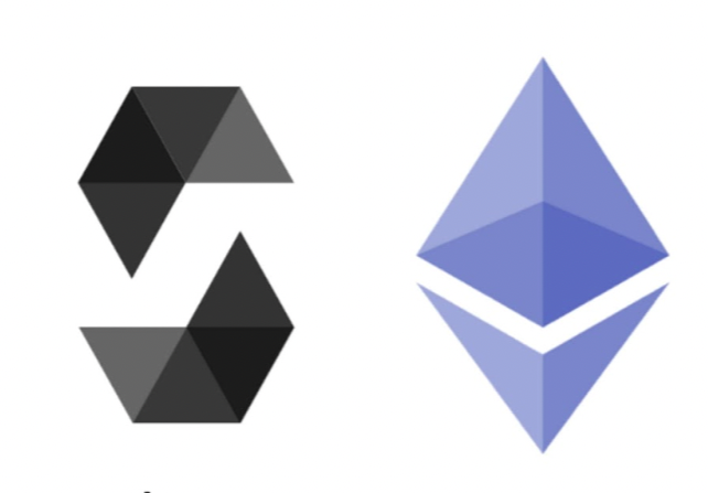
Looking at the logo alone, the general standard seemed to be geometric shapes that our previous logo would’ve seamlessly blended in with. However, there was no unique value presented in this design that gno.land so clearly had and was underrepresenting. I brainstormed the differences between the current logo and potential opportunities for improvement in the storytelling and especially brand perception. From this foundation, I wrote a brand mission statement, personality outline, and project values to lead all subsequent visual decisions.
design
Some of those core values included transparency, equality, simplicity and timelessness. Following the brainstorming discussion with stakeholders, I knew that our inspiration from the rebrand would draw from these values and show a glimpse into our digital metaverse. Using these themes in a design brief, I sourced and directed multiple external designer vendors and managed each engagement through delivery.
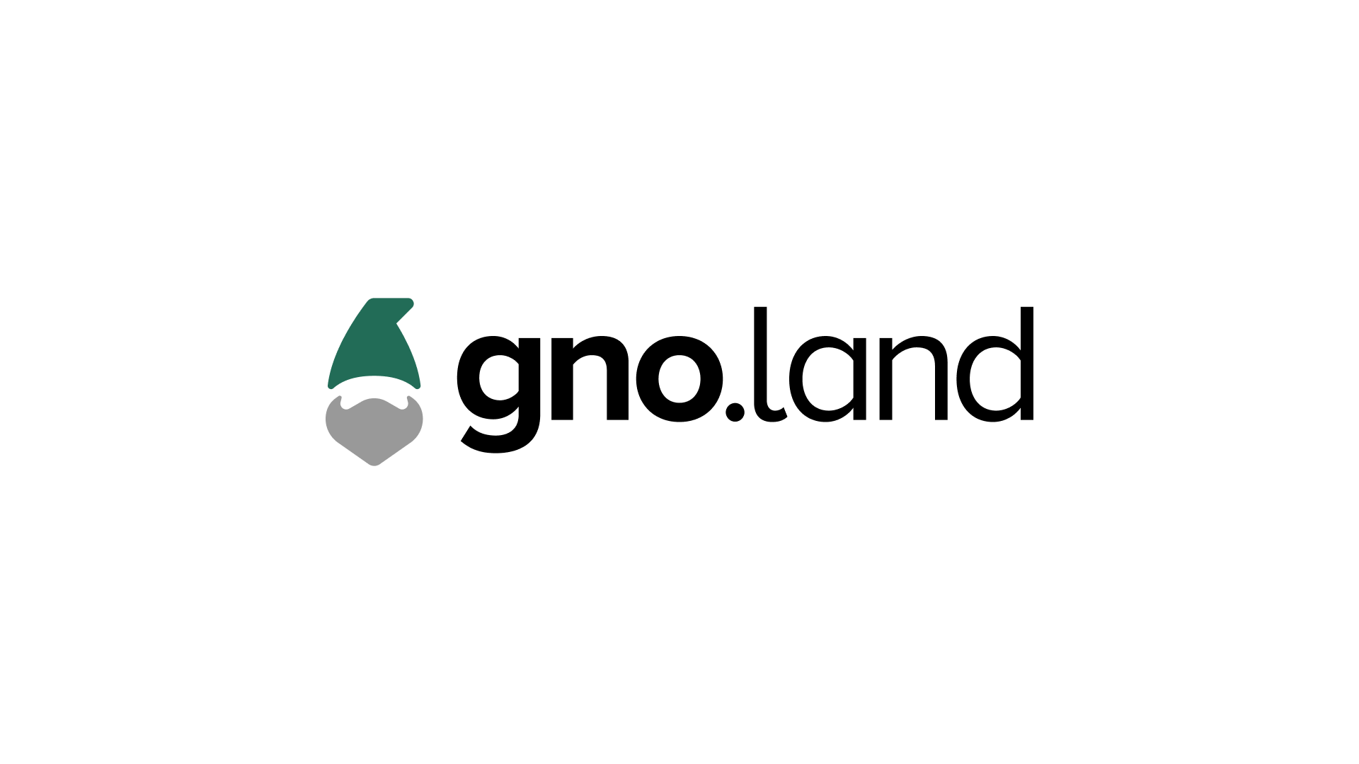
To encourage a more democratic process, final iterated concepts went to our engineering team for collective review. Our target users were developers, so the people closest to that audience served as the decision point. From the approved direction, I built the brand system including the font, logo, certain design elements and its written guidelines, which then became a regulated brand book. Every asset that went live was first reviewed with respect to the “brand bible” and then brought to me for approval.
Here is an excerpt from the brand book (blurred for NDA compliance):
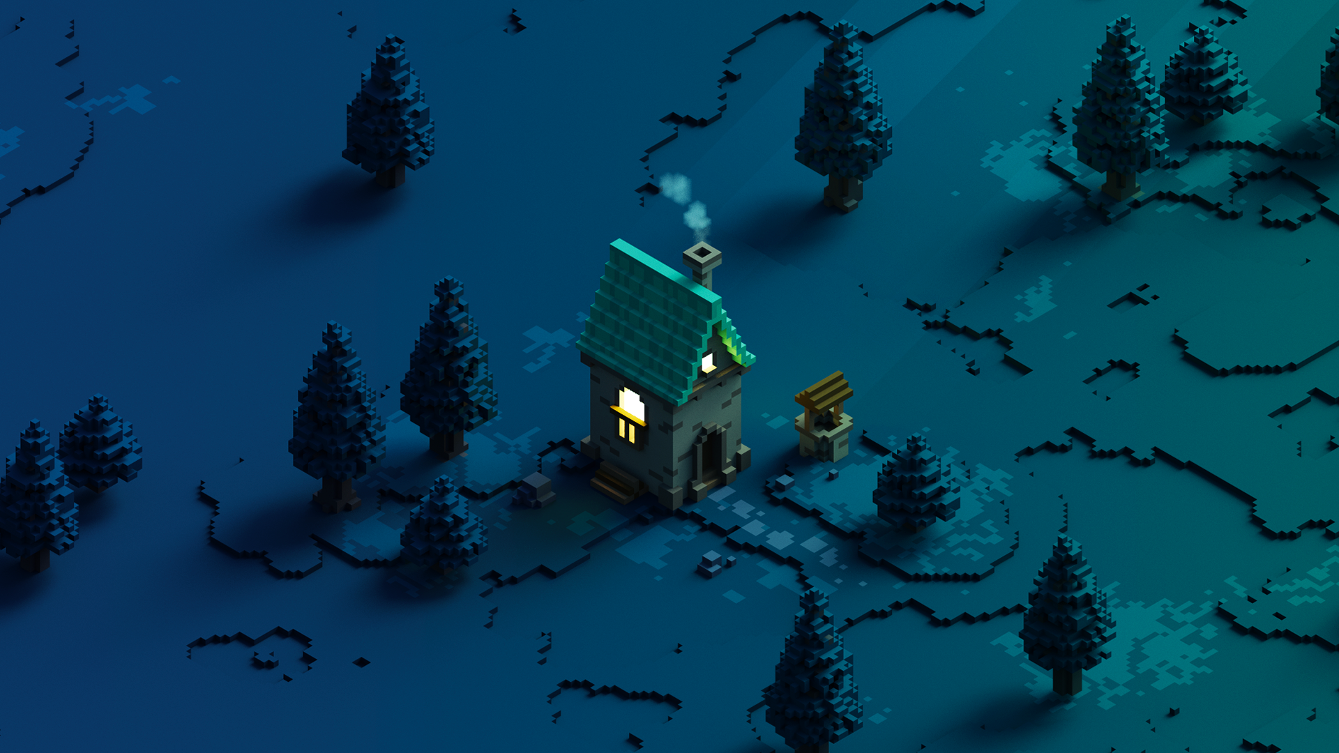
For some crucial design elements that we needed specifically for our public-facing design assets at conferences, I outsourced a unique voxel art designer, selected specifically because voxel art's geometric, simplistic, symmetrical aesthetic mirrored our user’s values without visually mimicking blockchain design tropes. Collaborating with this designer produced a lot of great content for each asset category (blog illustrations, social media, conference banners, physical merchandise). I maintained and directed this vendor relationship across every new production cycle, ensuring brand coherence through structured briefing and effective communication.
The brand system has remained strong since its creation and is continuously actively used across all digital touch-points.
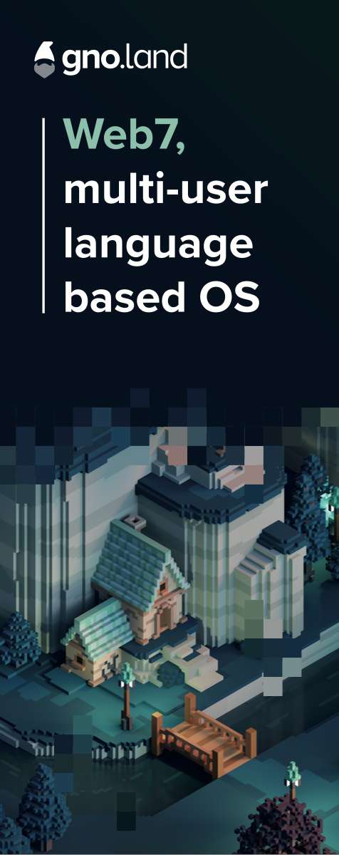
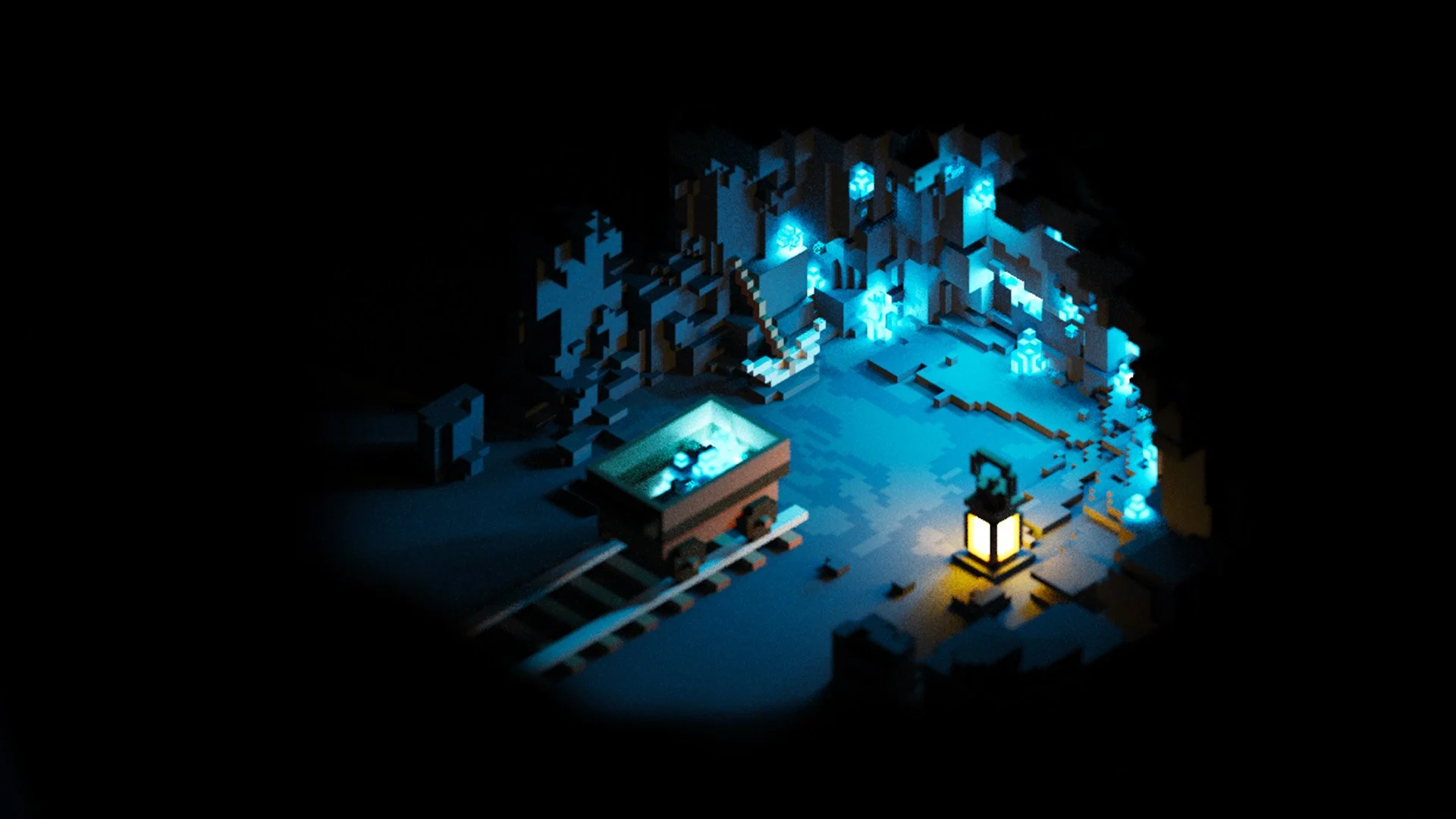
The team loved the end design! They appreciated the collaborative effort and felt that it best represented the company values as well as the distinction between the Gno VM and the theme of community/universe embodied in “land”. But the real questions that I needed to consider as the user spokesperson in a branding chair were as follows:
How do people think of us as a blockchain smart-contract platform?
What do they think of our design?
How do they perceive us compared to other blockchain tooling companies?
evaluative research in brand perception
Before the new brand was shipped, I would have preferred to conduct a formal brand perception study to examine opinions and interpretations of the visual design throughout the process. But choosing in-person feedback with real target users (actual Go developers) provided meaningful qualitative data. At developer conferences like Gophercon (a conference created specifically for the Go language), I collected feedback from Go blockchain developers, the target audience that our platform was designed for.
Across nine different conversations, (mostly initiated by the developers themselves before I could prompt them) they described the visual identity as "fun and new," "different and refreshing from typical crypto branding," and yet aligned with the technical, collaborative ethos of the open-source community. They were intrigued by the “gnome” logo and questions led to deeper conversations with our team members, spurring interest in the platform and even our hiring. Several developers who were already familiar of our presence online volunteered that they preferred the new design to the previous direction. Because the feedback was largely unprompted, it eliminated the social-desirability or politeness bias of a moderated session.
These kinds of signals came from the right people at the right stage of the design process. Feedback from these target users gave early validation that understanding our users provided the foundation for a new brand to succeed.
what would be nice
With more runway, I would have sought a more empirical framework with a brand perception survey before and after the rebranding. Devs who approached the booth were already ready to invest time with us and curious to know more.